Contents
Foundations
The laboratory, the manifesto, the principles.
Logo
Mark, wordmark, clear space, misuse.
Color
Two palettes, strict roles.
Typography
Typefaces, scale, typesetting.
Visual Language
Imagery, surfaces, motion.
Voice
Tone, writing rules, do & don't.

The Laboratory
Sensus AI is an interdisciplinary laboratory at the intersection of art, science and technology — a research space devoted to emotion, perception and human experience. Not a software house.
Installations and
generative worlds
Cited research,
honest claims
Camera biometrics,
processed locally
Emotion is the most important human interface.
Before every decision, there is an emotion.
We don't design interfaces. We design emotional states.
The best technology is the one that disappears.
Brand Principles
Calm over noise
The brand whispers. Generous space, slow motion, one idea at a time.
Technology that disappears
The interface recedes. The experience — image, sound, light — is the protagonist.
A gallery, not a landing page
Communication is curated like an exhibition — editorial, unhurried, never salesy.
Estimates, not diagnoses
Scientific precision in every claim. Sensus AI is not a medical device, and never pretends to be.
Audiences



The Mark
Two rounded strokes form an S — two signals in dialogue: the person and the environment. The gradient always runs from signal blue to iris purple, top-right to bottom-left.
- —Used alone for avatars, favicons and small spaces
- —Never redrawn, re-angled or re-colored
- —Lives on dark, white, or protected imagery only
 96 / 48 / 24 px
The Wordmark
Inter Semibold (600), one weight. Tracking −2%. Never restyled.
Human and quiet — never capitalized, never letterspaced.
Set at the same size as "sensus", aligned to its cap height.
The blue-to-violet gradient belongs to these two letters alone.
Logo on Backgrounds

Clear Space & Minimum Size
The protected zone equals the height of one stroke — x — on all four sides. Nothing enters it: no text, no edges, no other marks.
Logo Misuse

Institutional Palette
The public face: sensusai.pt, print and press. Calm, deep, editorial.
Background. The canvas for everything.
Raised panels and sections.
Highest elevation, hover states.
Primary — actions, identity
Eyebrows, links, focus rings
Success, Social Keys
Headlines, primary copy
Body, captions
Console Palette
The Sensus Hub console: neon telemetry on near-black. The one place the brand is allowed to glow.
Primary, session state
Secondary accents
Live biometric readouts
Positive, stable states
Errors only — never decoration
Color Roles
Gradient & Glow
arousal 0.31 · gaze ↗
Telemetry, metrics, hex values, units. Never running text.
Print headlines may use PP Neue Montreal where licensed. Inter is the approved digital substitute.
Type Scale
samples shown at 2×
Typesetting Rules
tracked tight
Weight 500, letter-spacing −2%. Display type is never bold.
+20% tracking and semibold belong to uppercase eyebrows and sublabels only.
Title Case and ALL CAPS headlines don't exist in this brand.
Numbers, prices and units set in mono — words never are.


Imagery Principles
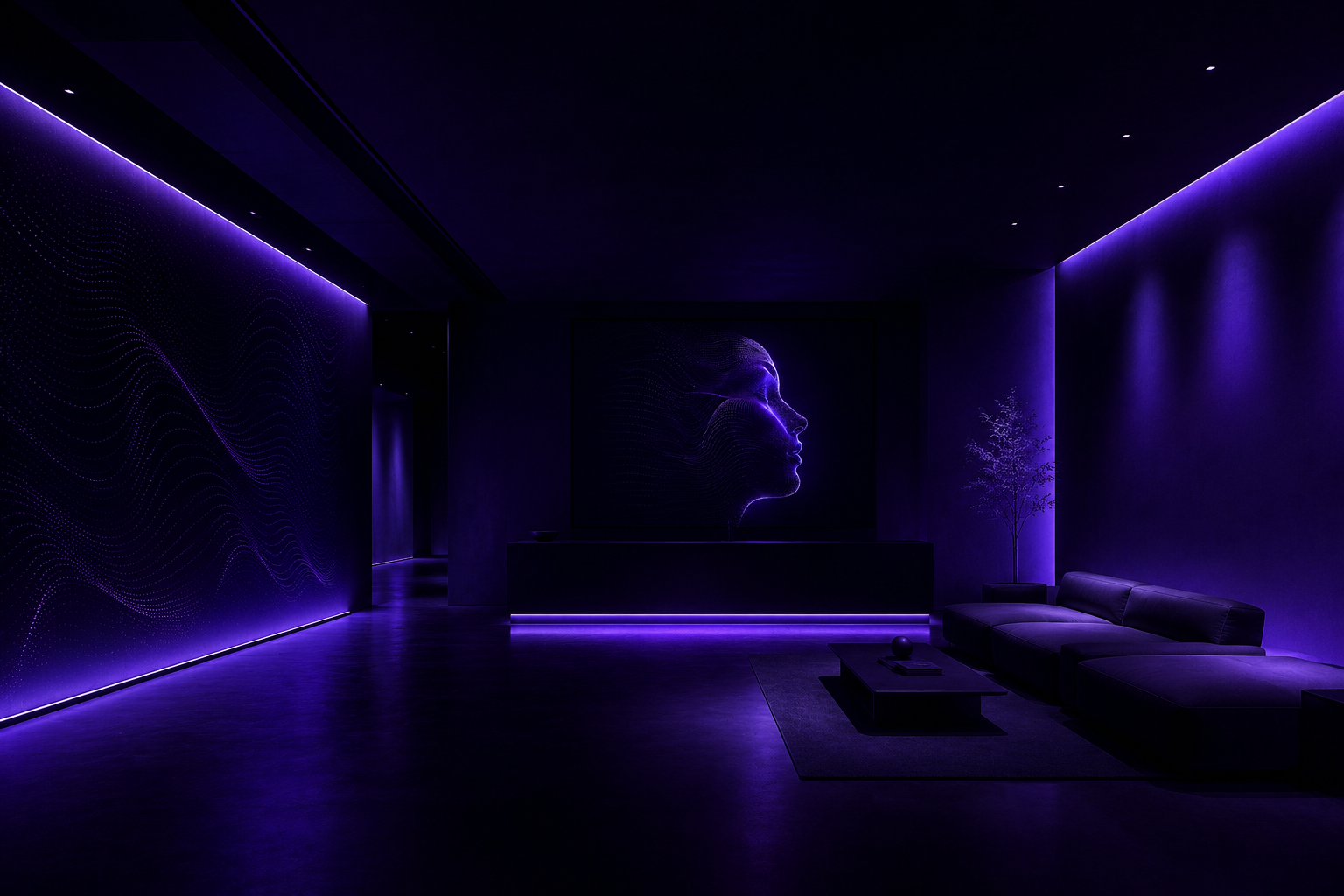
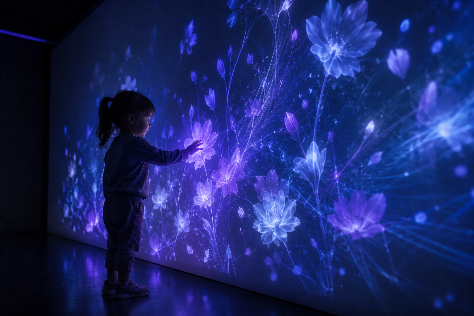
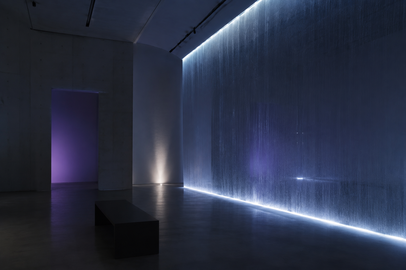
Scenes live at night. Deep blue-black is the canvas, never grey.
One luminous source per frame — and it is always the experience itself.
Faces turn toward the light, not the camera. Wonder, not spectacle.
No daylight offices, no devices in hands, no posed smiles.
Imagery Themes


One theme per campaign. Themes may meet people — never each other.
Surfaces & Depth
rgba(255,255,255,.04) · border 8% white · radius 24
Motion
Content fades in and rises 8px as it enters view. Nothing slides across the screen.
Live and biometric elements pulse at a resting-breath rhythm. The brand's only loop.
Controls answer quickly and quietly — opacity and 1% scale, never bounce or spring.
Reduced motion is always honored — every experience must work perfectly still.
Tone of Voice
"Tecnologia que compreende o que sentes."
Technology that understands what you feel — the tagline is the tuning fork for every sentence.
Second person singular — "tu", never "users". Softly, directly.
What it does to you first; how it works second.
Claims carry sources. Estimates, never promises or diagnoses.
No exclamation marks, no "revolutionary", no urgency.
Writing Do & Don't
"The camera estimates your heart rate. No image ever leaves your computer."
"Our revolutionary AI reads your mind in real time!"
"The environment gently guides you toward a calmer state."
"Clinically proven to cure anxiety — guaranteed results."
"See the experience."
"BUY NOW — limited-time offer, don't miss out!"